01
One path, not separate pages.
Yours: two campaign pages that do not lead into each other. The quiz page sends buyers on to a third page; the offer page to a checkout on the page itself.
Ours: one chain of three pages. The story leads to the quiz, the quiz to the offer, and the offer opens with the reader’s own answer: her concern and the plan the quiz chose for her. A reader who is ready can skip straight to the offer.
Why: the page should continue the ad’s promise in the same words (checklist C1‑01), and a story page before the product page is a recognised format for cold Meta traffic (C1‑11).
02
A quiz that ends in a plan.
Yours: one question, answered in the next line.
Ours: five short questions: what bothers her most, for how long, what she has tried, how her gut takes new supplements, and whether she has taken Tributyrin-X before. The result names her concern and picks one of your two subscription plans by your own plan notes: a first start gets Start & save, “Best for dialing in your dose”; a returning buyer gets the 3-month plan, “For once your dose is established”. It shows your dosing help, a buyer whose words match her concern, and the button. No email asked, and no dose suggested.
Why: a quiz works when its result screen carries the recommendation and the buy button, not only an answer (C2‑04). With one product there is no product to choose (C2‑07), so our quiz chooses the plan, the real decision on your page.
03
One set of numbers.
Yours: each page carries its own figures, so a buyer who opens two of them sees different numbers: four review counts (over 450, 452, 500+ five-star and 680) where your product page says 788, two customer counts (30,000+ and 40,000+), and two discounts (15% and 30%).
Ours: one set of numbers on every page, taken from your own product page: 788 reviews, with the full spread of 650 five-star, 104 four-star, 20 three-star, 7 two-star and 7 one-star. The quiz and the offer read them from one shared list, so they cannot drift apart.
Why: the rating and review count next to the product name answer the cold visitor’s first question (C1‑05), and a real spread is trusted more than a wall of five stars (C4‑01).
04
Claims you can stand behind.
Yours: some lines go further than the evidence on the page, like results “in days” or “for good”, or weight loss.
Ours: only claims your product page already makes as plain product facts: 99% pure research-grade oil, slow-release butyrate that coats the intestines, 500 mg per gel cap, free from gluten, dairy, soy, added sugar and GMOs, and the 60-day guarantee.
Why: under the FTC’s guidance, a testimonial cannot carry a claim the seller could not prove directly, and “results not typical” does not fix a dramatic one (FTC wording rules CX‑01, CX‑02).
05
The offer, decided in one look.
Yours: the offer page shows one plan only, a monthly subscription; the quiz page shows no price.
Ours: your three plans side by side, each with its price and saving: Start & save at $71.55 a month, the 3-month plan at $67.57 a month, and Try it once at $79.50. The delivery and billing terms of the chosen plan sit right under them, “Modify, skip, or cancel anytime” sits directly above the button, and one buyer’s line sits inside the longer plan.
Why: the price options belong together with the terms right under them, and “cancel any time” before the button (Shopify’s own guidance, C4‑07, C4‑08); a review line beside the higher-priced choice (C4‑02).
06
Built for the phone, and for the desktop too.
Yours: 20 to 24 phone screens per page; on a desktop the phone column sits in the middle of the screen.
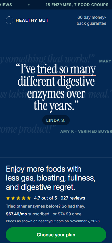
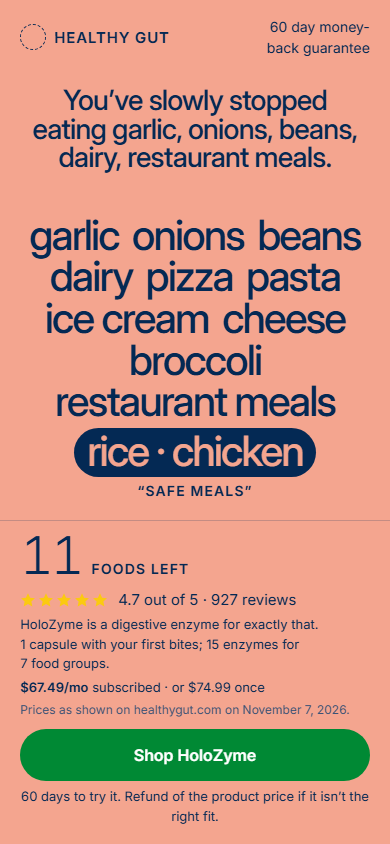
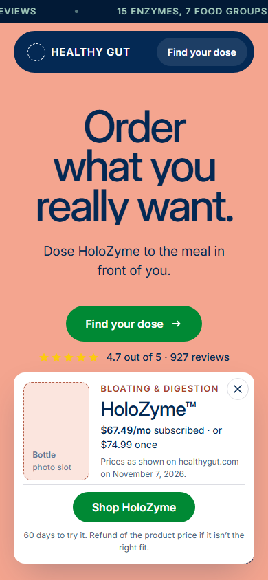
Ours: on a phone, the story page’s first screen already holds the name, the rating, the price, the button and the guarantee; the offer page opens with the plans, and a bar with the price, the guarantee and the button stays in reach. On a desktop, the pages use the full width in your colours and type.
Why: most landing-page visits come from phones (83% in Unbounce’s data, all industries: C1‑07), and most viewing time is spent in the first two screens (57% above the fold, 74% in the first two, in an eyetracking study on desktop: C1‑06).
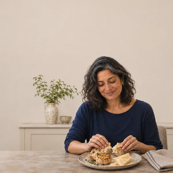 Bloating? Loose stools? Foods you react to?Five questions sort out where your gut should start.Take the 5-question quiz
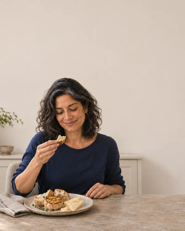 Bloating? Loose stools? Foods you react to?Five questions sort out where your gut should start.Take the 5-question quiz
 Bloating? Loose stools? Foods you react to?Five questions sort out where your gut should start.Take the 5-question quiz